Our Transit Report Card analyzes how states compare on transit access and support. To understand how our figures match up in the context of other countries, we took a look at one of our peers: Australia.
In part 1 and part 2 of this series, we compared U.S. states’ support for transit based on funding and access. Those figures are hard to understand without context, so we found ourselves asking: how do U.S. states compare to similar jurisdictions in other countries when it comes to transit policy?
But “similar jurisdictions” don’t exist in many other countries. Most other industrialized countries either control all transit policy at the national level (think the United Kingdom, France, and Japan) or cede only limited power to sub-national governments (think Germany, Mexico, and India).
We were, however, able to find one country with sub-national governments that have primary control over transit policy. That country is Australia, which funds its transportation infrastructure much like the U.S. does. Their national government distributes transportation funding directly to states and territories in the form of block grants. States and territories, in turn, direct that funding to specific projects, including public transit. Though the Australian system is different from ours in meaningful ways (like their more streamlined federal investment approach), their structure is similar to our own, where state governments dictate the vast majority of transportation spending and policy.
So we partnered with Movement & Place Consulting, a Melbourne-based transport consulting firm, to rate Australia’s nine internal states and territories on some of the same metrics that we used to rate U.S. states.
VMT
Americans drive more miles and ride less transit than Australians. Pre-pandemic, over 76 percent of Americans drove alone to work, compared with only 62 percent of Australians. On the other hand, 5 percent of Americans used public transit to get to work, compared with 12 percent of Australians commuting by train or bus.
To better understand this phenomenon, we measured how much Americans and Australians drive, measured in annual vehicle miles traveled (VMT) per capita in each U.S. and Australian state.
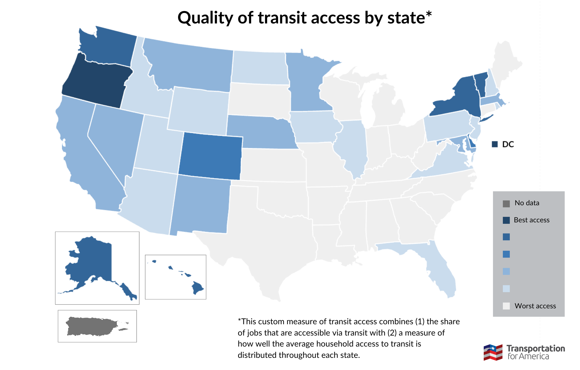
As we explained in part 2 of this series, most American states see over 10,000 miles per capita, with just a few exceptions. Washington, Oregon, Alaska, Hawaii, Illinois, New York, DC, Pennsylvania, and Rhode Island all had less than 8,500 VMT per capita in 2019, the year before the pandemic changed driving patterns around the country. But how does that compare to other countries?
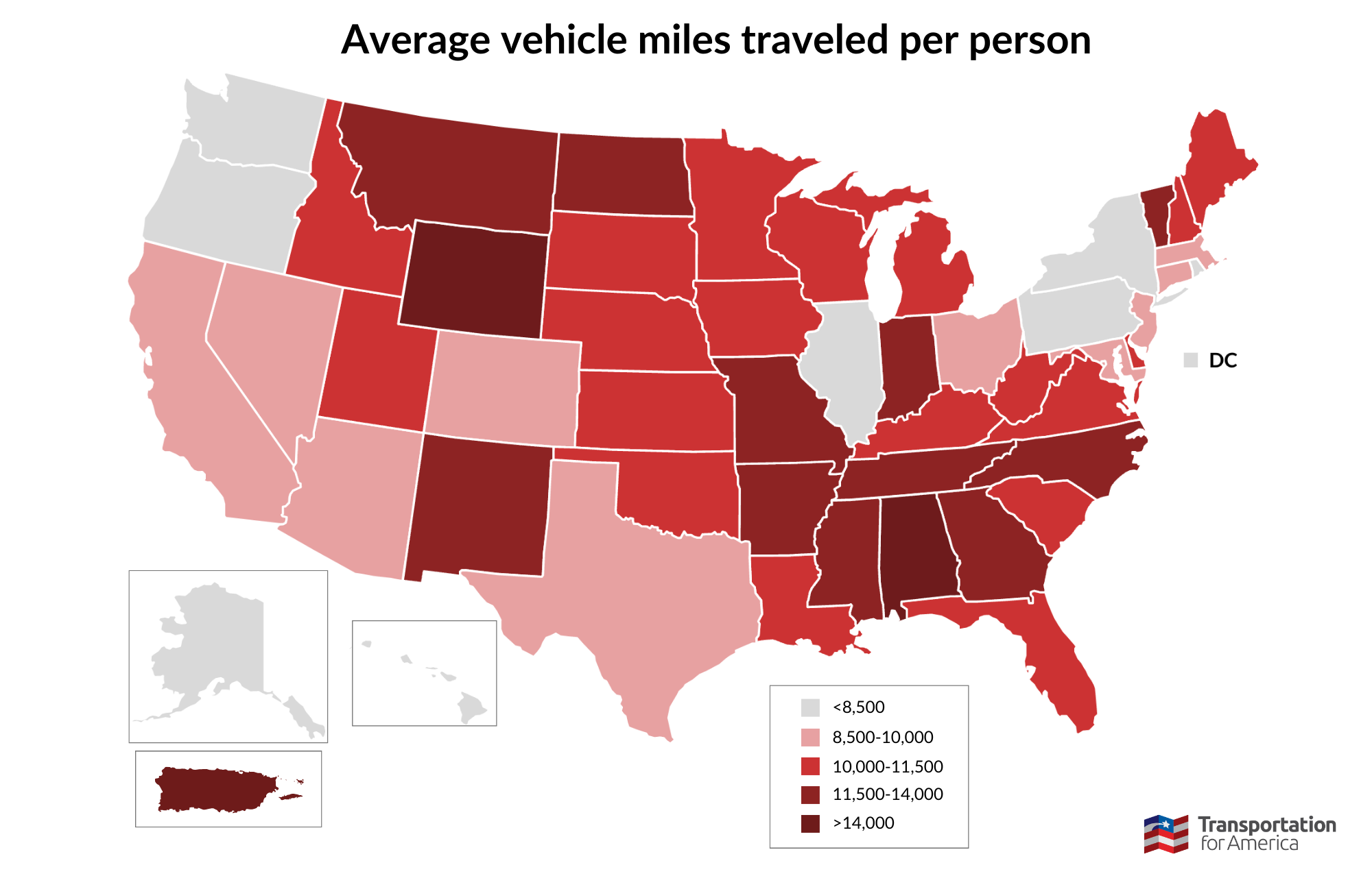
Map is not drawn to scale. Based on 2019 VMT data.
Australia, despite being far more sparsely populated than the U.S., does not even come close to our VMT per capita. The highest VMT Australian state, Western Australia, drives about the same amount (6,430 miles per person per year) as the lowest VMT U.S. state, New York (6,373 miles per person per year). And every Australian state fits within the lowest category of our U.S. map. So the Australian map looks stark in comparison:
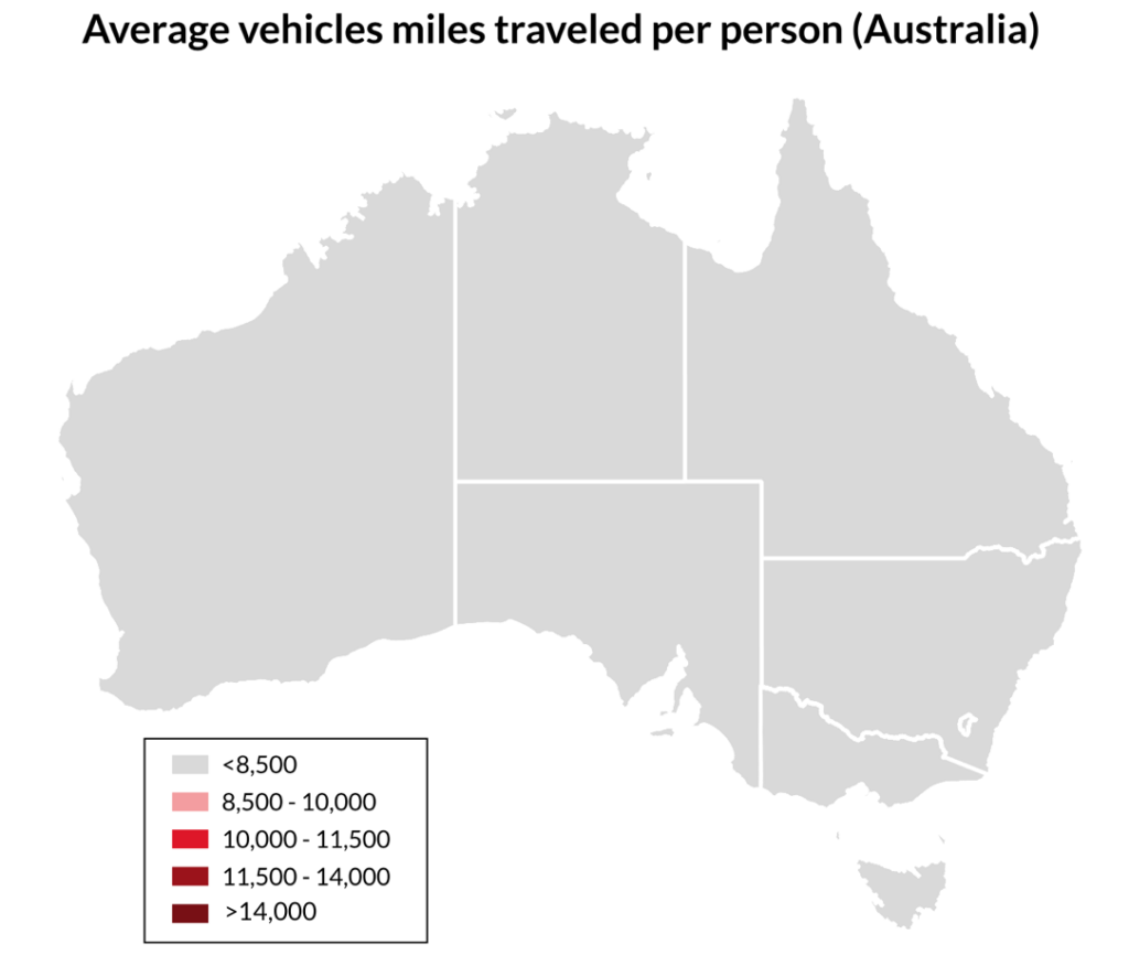
Australians are able to have a significantly reduced VMT per capita as residency is highly concentrated within a single point in each state. While in most U.S. states, 20 percent of the population lives in their largest city, approximately 67 percent of Australia’s population lives in each state’s capital city.
These sort of dense land use strategies are proven to help reduce carbon emissions by making it easier for people to drive less. They are also proven to help grow local economies, improve access to recreation and exercise, and prevent traffic deaths (in all sorts of communities, not just urban ones).
Access
VMT per capita provides the most straightforward comparison between the U.S. and Australia, but what about access? For our U.S. analysis, we took a look at federal data to get a sense of how well transit was connecting people to their essential destinations. This gave us a transit access index, which we converted into state rankings.
Australia does not have a database equivalent to what we used in our U.S. access analysis. But we can learn a lot about Australians’ access to transit by examining its land use strategies. Land use is in fact so central to transit quality that the Federal Transit Administration (FTA) has made it a core priority.
Let’s compare two metro areas of roughly the same population: Greater Phoenix (pop. 5.01 million) and Greater Melbourne (pop. 5.03 million). Melbourne’s transit system, Public Transport Victoria, carries around 600 million riders per year. Even prior to the COVID-19 pandemic (which reduced transit ridership across the country), the Phoenix region’s transit system, Valley Metro, carried only about 66 million people per year.
Why do Melburnians ride public transit so much more than Phoenicians? Funding is certainly part of the equation, but perhaps more importantly, Melbourne’s land use is much denser and overall more conducive to transit access. Greater Melbourne has 1,305 people per square mile, compared to Phoenix’s 332 people per square mile. Melbourne’s denser population is much easier to connect by transit. In addition, Public Transport Victoria has constructed an interconnected system of heavy rail, trams, and buses in a way that connects even the most remote suburbs.
By comparison, Valley Metro operates only one light rail line, and while the city operates a bus network as well, frequent service is few and far between. Even the most frequent lines operate 15 minute headways during peak hours and 30 minute headways off-peak, not even close to the frequency or reliability of Melbourne’s transit network.
So the question of why Melburnians ride more public transit than Phoenicians becomes obvious: there’s more of it. Melbourne runs faster transit, of more variety, and with more frequency. And while Phoenix might be just one example, its story is all too familiar in cities across the United States.
Funding
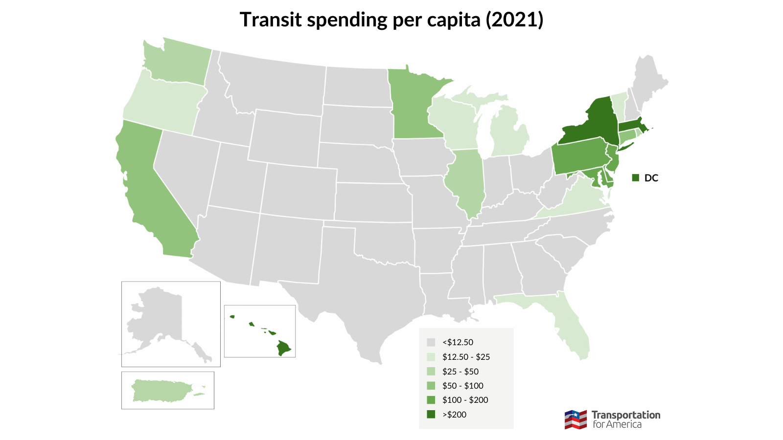
Our funding analysis of U.S. states is much harder to compare to Australia’s, but that’s kind of the point. Australian states spend much more on transit overall, but it’s not because they have more money to work with.
The U.S. earns most of their funding for transportation through gas tax revenue. However, the vast majority of U.S. states restrict the amount of funding that their legislatures can allocate to transit systems. This creates a counterintuitive cycle. Without efficient and convenient public transit service, Americans are forced to drive more, leading to more money spent on gas taxes that then cannot be invested in alternative forms of transportation.
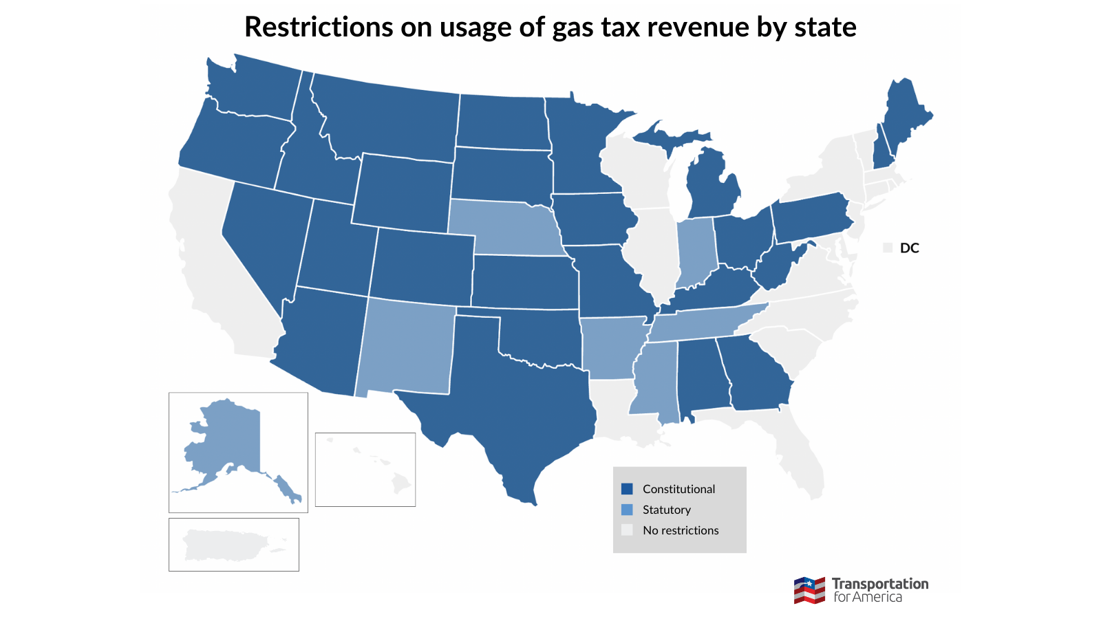
Map is not drawn to scale.
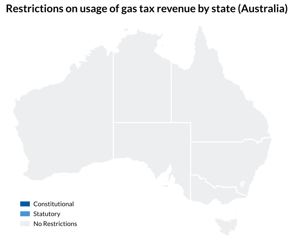
In comparison, Australia’s constitution does not explicitly discuss transportation funding—states are able to fund public transport as they deem appropriate. Furthermore, funding for Australian transport infrastructure is supported mainly by general taxation revenue and council rates rather than depending largely on gas tax.
The result: Australian states devote much more of their resources to public transit than U.S. states. Even Australia’s most remote and sparsely populated territory, the Northern Territory, spends more on public transit per capita per year ($183.48) than every U.S. state except for New York ($255.90), Massachusetts ($238.76), Hawaii ($220.98), and Maryland ($198.72).
Lessons learned
Even the best U.S. states have a long way to go in comparison to their international peers. This point became clear in our conversations with Australian experts while doing this research.
It’s easy to dismiss international transit comparisons as “apples to oranges.” But that excuse crumbles when the comparison is being made to a true peer like Australia. Both countries are large, developed, constitutional republics with low national population densities and strong sub-national governments.
While Australia’s transit system is far from perfect, the United States can learn a lot from our friends across the Pacific. We can have suburbs while still increasing density to support transit. We can have a robust highway system while still giving people other high-quality options. And we can do it by integrating transit systems to create a convenient user experience.
We can, and we must.
Learn more about our state-by-state analysis of transit support and availability, and see a full table of results. Click here >>
We received support in writing this blog from Movement & Place Consulting, a Melbourne-based firm that conducts analysis on land use and all modes of transport planning, parking, and economic development. Follow them on LinkedIn to stay informed on their work.