Safety over speed week: The key to slowing traffic is street design, not speed limits
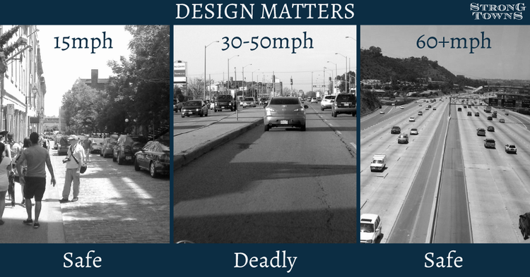
Today, as “safety over speed” week continues, we’re running a guest post from our friends at Strong Towns that uses some simple pictures to explain how street design is a far more powerful tool for slowing down traffic and prioritizing safety compared to the strategy of lowering speed limits.
It’s “safety over speed” week here at T4America, and we are spending the week unpacking our second of three principles for transportation investment. Read more about those principles and if you’re new to T4America, you can sign up for email here. Follow along on @T4America this week and check back here on the blog for more related content all week long. Today’s post was written by Strong Towns and was originally posted in January of this year. We are thankful to Chuck Marohn and his Strong Towns team for letting us repost it here.
The cost of auto orientation—designing our towns and cities around the easy, fast movement of cars—is not just measured in dollars and cents. The number of U.S. traffic fatalities in 2017 topped 40,000 people. Nearly 6,000 of those people were on foot—a 25-year high. Each of those people had a unique story. Each of them had a family.
And after each high-profile crash, we all hear the same litany of advice from law enforcement and traffic safety professionals.
“Be hyper-aware of your surroundings.”
“Always obey the speed limit.”
“Speed is a factor in 30 percent of crashes.”
“Safety is a shared responsibility.”
And yet, we know that people are sometimes going to make mistakes. Even conscientious drivers make mistakes. People walking, going about their business, are going to make mistakes. No one is going to be hyper-vigilant every moment that they’re out in the world. And why should we have to?
We can’t regulate our way to safety. We must design our streets to be safe.
Two simple photos reveal what it means to design a street to be safe, versus counting on the speed limit alone to do the job. This meme was created by planner Wes Craiglow of Conway, AR, and shared on social media by the “Transportation Psychologist,” our friend, Bryan Jones. We first shared it back in 2015, but it remains timeless, so here it is again:

As Wes points out: “The meme is intended to help viewers consider how different street designs makes you feel as a driver, and ultimately affect how you behave behind the wheel. Generally speaking, as depicted by the lower photo, narrower travel lanes, shorter block lengths, and a tree canopy, all contribute to drivers traveling more slowly. Conversely, wide lanes, long block lengths, and open skies, as seen in the upper photo, communicate to drivers that higher speeds are appropriate.”
Look again at the two photos. Imagine yourself behind the wheel of a car on each street. On which street would you drive faster? On which street would you exercise more caution?
“Forgiving” design is a misnomer

The first photo looks like tens of thousands of suburban streets all over America. It’s entirely representative of something the transportation engineering profession calls “forgiving design.” The premise is simple: drivers will make occasional mistakes—veer a bit out of their lane, fail to brake quite hard enough—and if the street is wide, with high visibility in all directions, and free of immediate obstacles such as trees and fences, those mistakes won’t be catastrophic.
The problem: this street feels too forgiving to a driver. Too safe and comfortable. So drivers speed up. The engineers didn’t account for this aspect of human psychology.
This residential street is built like a four-lane highway, and so even though its legal speed limit is 20 miles per hour, it’s no surprise when somebody guns it up to 40 miles per hour or more down a street like this. It feels natural to do so. It feels safe. But it isn’t safe—because on a city street, unlike a freeway, there might be people around. People who will most likely be badly hurt or killed if a speeding driver hits them.
The paradox of street design: if it feels a bit dangerous, it’s probably safer

The second photo, on the other hand, represents the most basic, frugal approach to designing a street for slow speeds. It’s not perfect. It lacks sidewalks or bicycle facilities, which some of our readers might take issue with—and yes, many places ought to have those things.
But this “slow street” does something really profound and important. It causes drivers to slow down, whether or not there’s a posted speed limit or law enforcement is present, because of the uncertainty and sense of heightened risk.
The street is narrow. Visibility is limited—look at that front left corner of the intersection, where a red fire hydrant stands next to a white fence. The lack of visibility there is not a safety hazard: paradoxically, it’s probably the single biggest thing that promotes safety at this intersection. Because if you’re driving here, and can’t see whether a vehicle is approaching from the left, what are you going to do?
That’s right. You’re going to slow down.
Why 20 miles per hour?
If we could keep most urban traffic to 20 miles per hour or less, we could eliminate the vast majority of deaths from car crashes in our cities and towns. We wouldn’t eliminate mistakes—people, both inside and outside vehicles, are going to make them—but those mistakes would rarely be deadly.

The place for wide lanes and “forgiving design” is on a high-speed road. City streets, on the other hand, should be places for people. We know how to design streets that will slow down traffic automatically, without the need for heavy-handed enforcement, and regardless of what the speed limit sign says. We just need to do it.
Read Chuck Marohn’s article on the crucial difference between a street and a road.
Learn more about our Slow the Cars campaign. Do you like this content, and want to help us produce more like it? Become a member of the Strong Towns movement, and support Strong Towns’s work to make our streets safe, welcoming, and productive places for people.
Thanks again to Strong Towns for participating in yesterday’s Twitter chat, for letting us share their content here, and for running our post on slip lanes from earlier this week.
