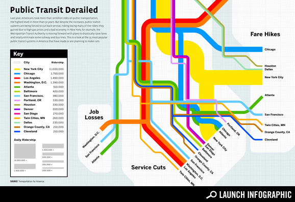
Good Magazine visualizes the United States of Transit Cutbacks
Good Magazine published their “transportation issue” last week, covering some of the current debates over where, why, and how to spend money on transportation. You might have caught the superb graphic of what makes a livable street that they produced for the issue in collaboration with our friends at Streetsblog.
Today, they posted this terrific visualization of our map of transit cuts. As you know, driving is down and ridership of public transportation is at record highs. Yet transit agencies across the country are facing layoffs, service cuts and fare hikes at a time when people need their services more than ever.
Click the graphic to see the full-size version from Good Magazine.


