Data Hub
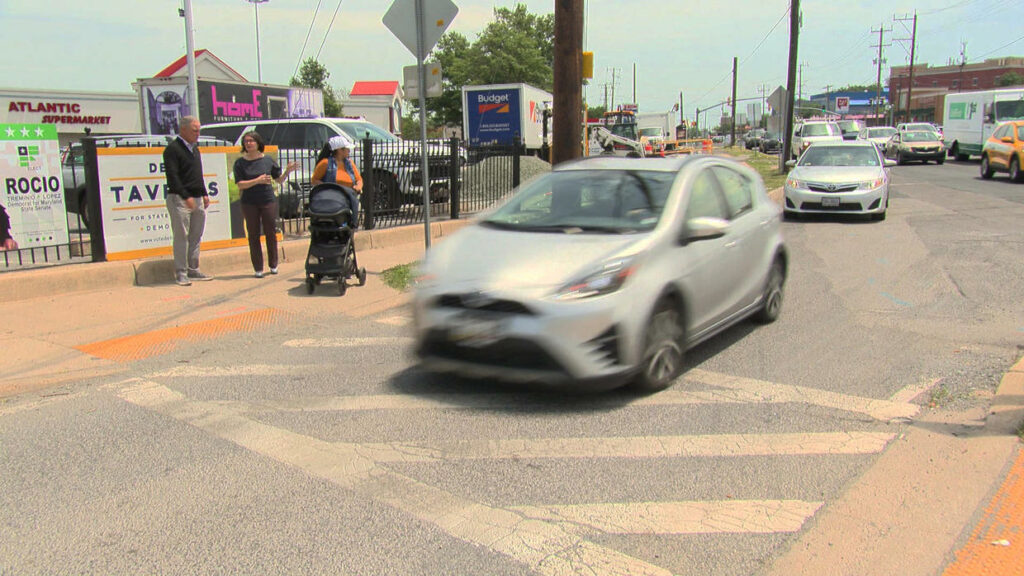
SafetyThough overall traffic fatalities have trended ever so slightly downward, roads in the United States are still among the most deadly and dangerous in the entire developed world and people are struck and killed while walking at historic levels. States control the most deadly roads and Congress gives them zero binding requirements to truly prioritize safety.
About the safety data
The fallacy that more people walking will inexorably be killed when driving increases was laid bare in 2020. During the first six months, driving went down 20 percent in the first six months during COVID, yet traffic deaths increased 17 percent. The first chart below shows the long-term trends in overall traffic deaths and the deaths of people struck and killed while walking, which went up 75 percent from 2010-2022.
Starting in 2018, states were required to set performance targets for safety as part of a new congressionally-mandated USDOT system of performance measures to assess federal investments in transportation. States are required to set goals each year for total traffic deaths, as well as the number of deaths + serious injuries for non-motorized users, which means people walking, biking, or using other non-vehicle modes of travel. The federal hub for this data is opaque, hard to find, and does not allow you to see multiple states at once, or easily see a state’s performance over time compared to the targets they set. The second chart below shows a national summary of the vulnerable road users people killed/injured each year, plus the sum total of the targets that states set.
TIP: Use the map above to explore the state-specific safety targets and data under Safety on each state page.
Pedestrian fatality data is sourced from the state-level data in Dangerous by Design, released by our colleagues at Smart Growth America. Data related to the state performance targets and measures comes from FHWA’s State Safety Performance Targets.


Help us improve this tool
Our three principles
Despite $1.5 trillion of federal investment since 1991, traffic, emissions, and pedestrian deaths keep rising. It’s time to focus on what truly matters: a transportation system that safely and efficiently serves everyday people.