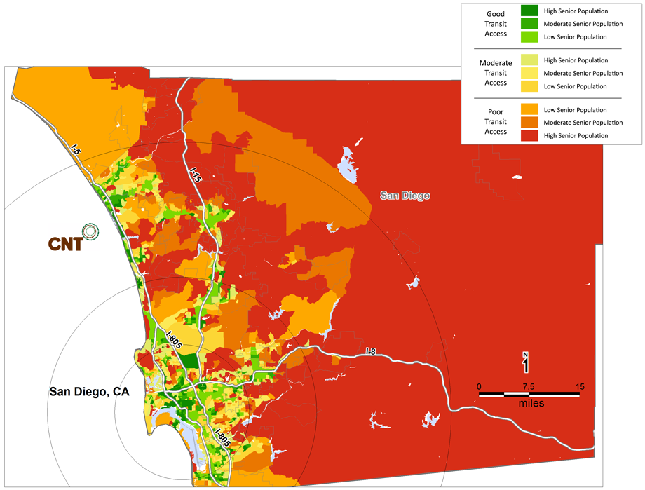
Each map is color-coded at the Census block group level to show both the intensity of public transportation – whether “poor,” “moderate” or “good” levels of service – and the density of seniors. By combining both variables into one scale, these maps show how “aging in place” creates a dramatic mismatch between transit services and senior demand. The first map for each case study overlays the population over 64 with areas of poor transit access in the year 2000. The second map shows the population age 65-79 projected to have poor transit access in 2015.
Transit Access for Seniors Age 65 and Older in 2000
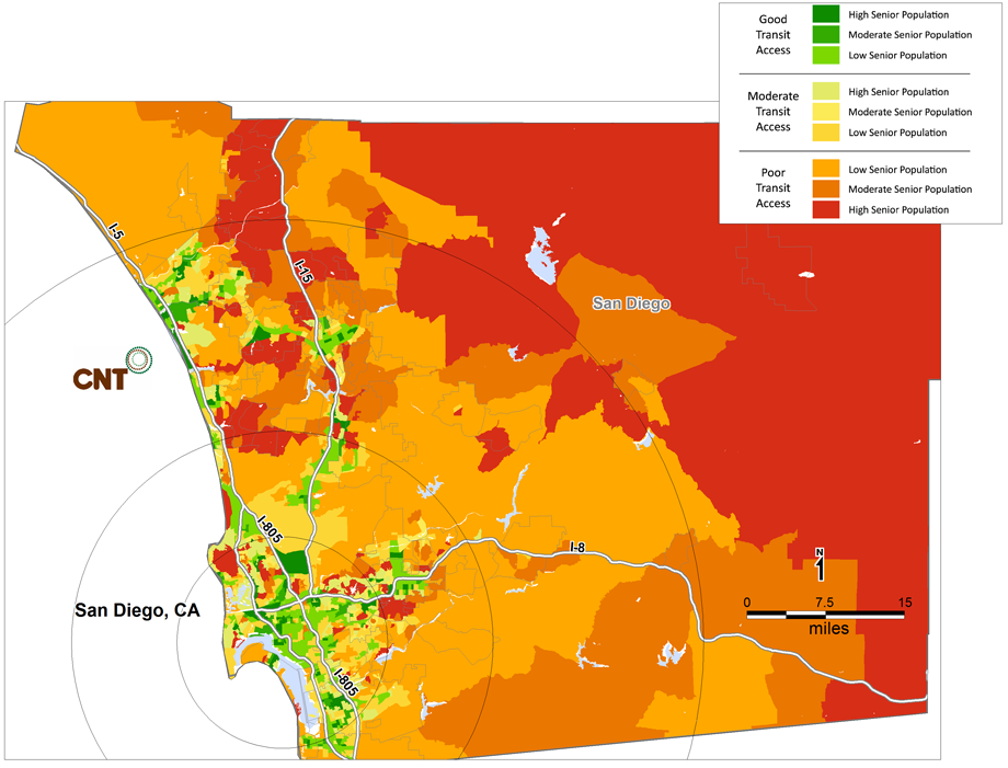
Transit Access for Seniors Age 65-79 in 2015